February Favorites!

Thursday, February 28, 2013

I feel like February broke the rut of beauty indifference that I was in during January. And I'm totally okay with that.


Eyes;


The palettes are NARS And God Created Woman and bareMinerals Ready Eyeshadow 8.0 in The September Issue. Both have phenomenal pigmentation and gave my Naked Palettes a bit of a break. I've also been using the NYX Nude Matte Eyeshadow in Confession a whole lot.

Cheeks;


NARS Blush in Seduction. This one is intense, but I love it. When applied properly its really stunning.

Face;


I branched out and tried a new foundation this month, Neutrogena Shine Control Makeup. I was getting frustrated with Revlon Colorstay Whipped, so I wanted something with a completely different. This has a thin consistency and dries down pretty quickly, but is actually really buildable. This keeps my oily skin at bay a little bit longer than most other foundations that I've tried. Since my skin has been in rare form lately (2013 has been a bit on the stressful side thusfar) I decided to try the Physicians Formula Conceal Rx Physicians Strength Concealer in Soft Green. This concealer is SUPER pigmented, blends well and does wonders for covering my blemishes and red splotches on my cheeks.

Lips;


I went through a stage in December/January where I did not feel like wearing a bold lip in the least. That ship has far since sailed; I was really loving MAC Daddy's Little Girl and MAC Diva this month. I also stumbled across a Bath And Body Works Liplicious Lipgloss in Blood Orange; Its sheer but gives a bit of a pinkish-red hue to my lips with a bit of multi hued sparkle. I LOVE the flavor; probably why I purchased it..

Body;


I've been definitely breaking out of winter in terms fragrance this month. I've really been liking the PINK Spring Break by Victoria's Secret in Jasmine Lime (which is Jasmine and Lime...) and Bath and Body Works Daisy Dreamgirl (which has clementine, star daisies and sandalwood). I also picked up The Body Shop Hand Cream in Absinthe, and I'm already in love. Its not too thick and doesn't leave my hands too slick and feels cool when applied. 

Good month for beauty; things are looking up!


Review - NYX Nude Matte Eyeshadow in Confession

Wednesday, February 27, 2013

Shout out to those special products in my stash that have been deemed "compliment getters". This, my friends, is the newest inductee.


If my memory serves me correctly, the Nude Matte range by NYX was introduced sometime in 2012, and I'm just now getting around to picking some of these up. I chose this shade, Confession along with another called Skinny Dip.

Confession is a deep olive green matte with a hint of brown to it. The shade in and of itself is flawless, I'm Irish, so greens are quite flattering on me, if I do say so myself. The formula however, is what really wows me.

This thing is like butta! So incredibly soft and pigmented, but only gave me a teensy bit of fallout (only in application) when I wasn't being careful. I wore this over MAC Haux with Urban Decay Snakebite in the crease and I lost count of the compliments I got on my makeup that day. Its a nice take on a neutral tone and it made my pale blue eyes SING!

Overall;

Pros;

- Great pigmentation.
- Blended well.
- Soft application.
- Average wear, no early creasing.
- Neutral but not neutral.

Cons;

- Little bit of fallout in application if you're rough with it.

Overall I'm pretty much thrilled. Greens are lacking in my collection; I don't know why. For someone with Auburn hair, that ship should have already sailed! I love this little green dude.

9.5/10 - Recommended. 


Review - Maybelline Limited Edition Blush in Wild Blossom

So Maybelline's collection for Spring Fashion Week this year is neons/electrics...is this foreshadowing of the fashion world this spring? Hmm...

I'm not too much of a neon person (unless its a violet, them I'm "all about that life") so this blush, being a little less...well, neon, what all I hauled from this collection. - However, I saw Emi's at Project Swatch swatches of the Coral Burst shade and I might pick it up.

Hopefully that one performs a bit better.


Left is swatched heavily and right is blended out.

Wild Blossom is a lilac pink. Its a little pinker than what I felt it would have been, but its a nice shade against my skin regardless.

But..

It is a friggin glitter BOMB. I'm okay with shimmer or a sheen but when you have tiny, gritty, silver micro-glitter in a product that I'm going to put intentionally on my cheeks its just not really a good time. I have large pores and I feel like this just accentuated my already problem skin. 

Not to mention, this blush neither applied easily, nor stuck around for more than 4 hours. I'll still use it because I like the shade, but I had much higher hopes for this one...

Overall;

Pros;

- Unique Lilac Pink shade.

Cons;

- Glitter Bomb
- Gritty
- Short wear time
- Fussy application.

I wanted to love it. I tried to love it. My pores just hated it. Maybe I'll have better luck with Coral Burst, seeing as it is a completely different finish.

5.5/10.

Review - NARS And God Created The Woman Set

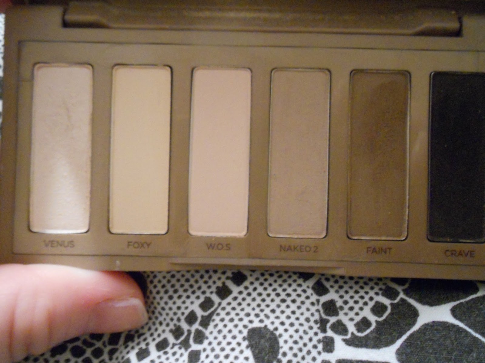
I don't need anymore neutrals...I need to make this my mantra, because it apparently hasn't set in.

But yeah, this one was worth it, even though I really didn't need it.


It bears noting that I couldn't wait until I photographed this to play with it...and to risk beating a dead horse, we all already know how dirty the packaging gets.


 To compare, this is the palette compared to my phone, which is an HTC OneX - which is already kinda giant phone wise, but it's about 3/4 of the size of my phone. (Anyone else appreciate my lilac pink glitter case?)


From left to right, the top row is;

Alhambra - This is a shimmering (no glitter) golden champagne. Its pretty soft, and it's kind of like a warmer and darker version of Urban Decay Sin. I have a myriad of shades like this, but I like the "warm but not too warm"-ness to it. This is available in a duo in the permanent range.

Bellissima - Taupe. Obviously we already know how I feel about taupe. I really like this one because 1) Its matte, and 2) Its a touch darker than the rest of my army of taupes. This is available in a duo in the permanent range.

Kalahari - This is a rose gold. The rosiness makes it a bit more wearable on my skin, and it has a nice metallic shimmer to it. This is available in a duo in the permanent range.

Galapagos - This is a medium/dark warm brown with gold micro-glitter. It was a really nice crease shade and blended out much easier than shadows of similar finish. The glitter doesn't really translate to the eye, but it didn't cause fall-out so its excusable. This is available in NARS' permanent single range.

Coconut Grove - This one is a dark, cool toned blackened brown. I wore this in the crease yesterday with no complaints and it definitely gave me some phenomenal definition. It's matte and slightly difficult to swatch, but application is actually pretty stellar. This is available in NARS' permanent single range.

Night Clubbing - This one had the most phenomenal pigmentation of the entire palette. It is a black with a plethora of gold micro-glitter. It applies like butter and with very limited fall-out for the type of product it is. This is available in NARS' permanent single range.

I'm actually rather impressed by this palette as a whole. When I swatched some of the more matte shades I had a bit of apprehension, but the way they apply makes up for any sheer swatching. It don't know what caused it, but all I know is that I'm okay with it. 

In terms of value, its moderate. The shadows included in this palette are almost half the size of the original singles. However, you're getting six of them, plus a primer and travel sized brush for just short of $60. Its a value set, one could say, but its not like a Urban Decay Naked Palette value set, if you catch my drift.

Speaking of the brush and primer; I've actually not tried the primer thus far. I'm saving it until when I run out of UDPP (as I'm strongly considering going a different direction after I'm done with this tube.) Therefore, I refuse to even open it yet so I won't let bacteria into it (Hey, if it goes on your eyes, you should be careful!). The brush (while short, being a travel size) is actually great. Its quite soft, but the bristles are long and in sort of a "fluffy/flat" shape. I also washed it already and saw no change in the feel and no bristles falling out. It felt luxurious. 

Overall:

Pros;

 - Glitter shades had no fall out.
 - All shades applied very well, and blended easily.
 - Good mix of mattes, shimmers and glitters.

Cons;

 - Glitter shades did not exhibit as much glitter as one would expect.

I had to have it, and I'm very pleased with it. Being neutral, I'm going to get a ton of use out of it, and being NARS it was worth the splurge.

This palette is also a limited edition Sephora exclusive. 


Review - MAC Archie's Girls Lipstick in Boyfriend Stealer

Thursday, February 21, 2013

When this collection first previewed, this was the shade from the get go that I knew I was going to purchase. I didn't even plan on purchasing Daddy's Little Girl until I was in store and feared it would sell out. In all honesty, despite my love for vampy shades, I really didn't have anything in my collection like Boyfriend Stealer.


I swatched Boyfriend Stealer (left) against the closest shade that I had in my collection which was Revlon Super Lustrous Lipstick in Violet Frenzy just to show the uniqueness of it. MAC describes Boyfriend Stealer  as a "Deep Blackened Plum", which is very apparent, especially when compared to "similar shades". It has a decent amount of purple to it, and it does read super vampy. The one thing, however that makes this a bit more wearable is the sheerness to it. It has a Cremesheen finish so it's not super opaque and intense in pigment, so it can be sheered out to a degree. I was able to build this up a bit on my lips, but it did have that dulled quality that, again, makes it a little less intense. When compared to Revlon Violet Frenzy it is much purpler and darker. Violet Frenzy is more plum, though the two do have a very similar finish.

My only complaint is the way this shade wears. While it isn't the most terrible Cremesheen that I've worn, I honestly just never really have good luck with Cremesheens as a whole (minus Outrageously Fun, but that was almost a fluke). I needed exfoliated, even and hydrated lips to wear this and I wasn't left with those lips when I was done as the formula dries my lips out something fierce. The wear time was not as phenomenal as other vampy shades in my collection, but put up against other Cremesheens like Shy Girl it definitely wore longer.

Overall;

Pros:

- Unique shade.
- Can be sheered out easily or built up for more pigment.

Cons:

- Drying
- Shorter than average wear time.

I'm glad I picked it up for the uniqueness of it in general, though it isn't a shade that I wear all too often. It is so freaking pretty though..

7/10

Review - Wet N Wild Color Icon Eyeshadow in Nutty

This shade has been buzzed about in the beauty blogosphere for a good amount of time now. No surprise, as most of us have encountered what a phenomenal formula that Wet N Wild has on their hands, but I've literally not been able to find it until now. Everywhere I go either does not carry the singles or is sold out of this shade, so when I found this one at the crappy Wal-Mart by where I work I was thrilled. In hindsight, I should have bought a couple of 'em.


Nutty is a slightly brown-ish taupe. And there is where the adoration lies. Anything taupe and I'm pretty much on board. It has strong pigment to it while being quite buttery. As with a good amount of Wet N Wild's eyeshadows, this does have a shimmery finish. I found very little fallout to this shade, which is pretty great for how soft it is to the touch. The shade in and of itself is one that has already found itself in my makeup circulation as of late. 

There's definitely buzz about this shade being a dupe for MAC Satin Taupe, and there are definitely some similarities. 


WNW Nutty is on the left and Satin Taupe is on the right. Nutty is lighter and a touch browner, while Satin Taupe is darker and cooler toned. On the eye they look a tad closer; I felt myself needing something that was a bit darker to use in the crease than Satin Taupe when I used Nutty on the lid. Similar? Yes, but if you're incredibly picky like I am, then I wouldn't exactly call them dupes. WNW's price tag is much more palatable than MAC's and with the two you would be able to achieve very similar looks.

Overall;

Pros:

 - Very Pigmented
 - No wear issues
 - No fall out

Cons:

- Difficult to come across?

Overall this is another addition to my "recommended" products. And if I can get my paws on it, I want one of these in Envy as well. 

10/10. Recommended.

Review - Stila Lip Glaze Trio in Flower Power

Ever since Ulta revamped their rewards system, I've been a happy girl. Especially since I only had to pay $3 for this set!

I had $9 off, and this was $12 for three lip glazes. Since I'd never tried them before (nor anything by Stila in general), I thought "why the heck not".

Flower Power consists of three Lip Glazes in on trend spring hues.


From left to right there are; Peach Blossom, Pink Orchid and Lilac.


Peach Blossom.


In the tube, Peach Blossom looks WAY out of my comfort zone (because its FRIGGIN ORANGE) but I was actually pleasantly surprised. It sheers out quite a bit and when it mixes the natural tones of my lips it reads more of a sheer peachy coral than anything. Out of the three, this had the most amount of shimmer; there are silver micro-glitters throughout. This one has a light fruity fragrance/flavor that was not too overbearing.


 Pink Orchid.

Out of the three, Pink Orchid had the most strength of pigment. Given its a formulated to be a sheerer than average gloss, I did get a good amount of softened fuchsia pink when wearing this one. This one has a little less shimmer than Peach Blossom, more of a pearl finish than a shimmery one. This one has a fruity/floral kind of fragrance/flavor (it actually reminded me a whole lot of Victoria's Secret Love Spell). 

Lilac


Lilac is the major reason that I bought this set. Its, well, Lilac, and thats 100% right up my alley. This is a sheerer and more wearable take on lilac with no discernible shimmer when worn. This one smelled a little grape-y to me (surprise right?) which kinda bummed me out. Overall, this shade is my favorite of the three (again, surprise right?)

I'm not, for the most part, much of a gloss person. I usually go for lipstick, as on average it wears longer and needs less touch up. If I'm out for shorter amounts of time or I'm just not feeling a lipstick, I'll occasionally opt for a gloss, and my stash is slowly growing.

While these aren't the stickiest glosses that I've come across, they are still on the stickier side of the spectrum. They don't have a whole lot of slip to them. However, what you are getting in stickiness is made up for in wear time. These gave me about three hours each, which is fairly long for glosses in terms of wear time for me.

The price (before my ridiculous discount) was what kinda made these for me. These are almost half of their original size (0.05 fl oz. versus 0.08 fl oz.), and the full sized ones retail for $22 each. That would roughly be $11 for one that is half size, and this retails for $12 for three half sized Lip Glazes, which is a pretty decent price.

Overall;

Pros:

 - Spring trend hues.
 - Decent wear time.
 - Three different finishes.
 - Fragrances were very minor.

Cons:

 - A bit sticky.

It boils down to the fact that these were a good product, and definitely a good deal, but I'm just not 100% blown away by them. Definitely not enough to buy these in a full size for $22, but if I find another set like this with colors that I like, I'll probably partake.

7/10.

Review - MAC Lipstick in Diva

Wednesday, February 20, 2013

I've said it before and I'll say it again. MAC has a phenomenal Matte formula on their hands. I have yet to stumble across one that I didn't absolutely love. Diva is no exception...but I might love it just a tad more...


MAC's official description for Diva is an "intense reddish burgundy" which is pretty accurate. Its quite dark and vampy, but does have those red tones that make it just a bit more wearable; Its vampy for those who like the vampy look, but are trying to ease into it. I wore this shade for a party themed "Old Hollywood" and it was a perfect fit, while being a bit different than the route most others chose. 

I own several MAC Mattes and have yet to have a complaint. They do not cause drying in my lips (in which mine are average/sensitive) and have a very subtle understated creaminess to them. They're most definitely matte, no shimmer or sheen about them, but its almost a modern matte, in that it doesn't look like I stole my grandmother's lipstick. Neither did I use a lipliner with this, and I experienced no feathering whatsoever. 

The wear time is really the showstopper for this shade. Once applied, it required no upkeep for the duration of the event and beyond, even when faced with beverages. It stayed until I chose to take it off, about 6 hours later, and came off quite easily with makeup remover, leaving only a minimal stain. 

When it comes to deep reds such as Diva, I'm most definitely not a stranger, but this one does stand out a bit against the rest of my collection. 


From left to right there are;

MAC Diva

Wet N Wild Cherry Bomb - This one had a very similar finish, but was a bit cooler toned and more purple. Diva has a bit more brown in it.

Rimmel Kate Moss 101 - This shade shared the "modern matte" finish, but had inferior wear time. It is also a touch less intense.

MAC Viva Glam 1 - This was my iconic holiday lip for 2012. Its most definitely matte, but is closer to a true, blue based red and much less intense than Diva.

And across the bottom because I ran out of room, Revlon Lip Butter in Red Velvet. - Which is much sheerer and closer to Viva Glam 1 than anything. Its a good transition shade.

Overall;

Pros:

 - Phenomenal color payoff
 - Did not feather
 - Long wear time
 - Non drying

Cons:

- ?
- ?
- ?

Obviously, I'm quite satisfied with this one. Satisfied enough to recommend it.

10/10


Review - bareMinerals Ready Eyeshadow 8.0 in The September Issue

Thursday, February 14, 2013

Note - I purchased this at Sephora on sale for $25 about a month ago. The website has it listed as full price, but still at Limited Edition. Check your local store for details.

Whenever I think bareMinerals, I honestly just think "face". I remember when the Mineral Veil launched and everyone thought it was the best thing since sliced bread.

Now when I think bareMinerals, its usually more along the lines of "HOLY CRAP THEIR EYESHADOWS". I don't know how they're doing it, but bareMinerals seems to  have one  of the best pressed shadow formulas on the market right now.


The Ready 8.0 Palette comes in a metallic silver case that one, will hold every single fingerprint (I swear you don't even have to touch it. You just have to think about touching it.) and almost makes the full size mirror in the lid superfluous. There is also a double sided travel sized brush that I'll probably never use. 

Now to the impeccable shadows. The top row, from L to R are;

Couture, which bareMinerals calls a "glimmering clove". Its a slightly bronze, cool toned brown, and really stunning on the lid. 

Silhouette, an "antique white" and I guess antique means slightly golden white. Its actually really different from anything in my collection.

Statement, which is a "vibrant orchid". It is a matte magenta/orchid with a little bit of glitter that neither really translates to the lid or causes any fallout. It most definitely is vibrant, but was a slight touch chalky (I've seen much worse, though).

Prêt-à-Porter (translates to Ready To Wear.) is a "sunbaked gold"' and is literally flawless. It is the most buttery, pigmented shadow of the bunch, and maybe of my collection. It is similar to Half Baked by Urban Decay but superior to it.

The bottom row, from L to R are;

Três Chic, which is a "apricot creme". It is matte, and is like a light mustard shade. It is far more flattering than I anticipated an is one of the softest mattes I've tried.

Editors Pick is a "metallic teal". It leans more true teal than blue teal or emerald teal, which sets it apart from other shades in my collection, like Urban Decay Loaded (which is more emerald teal). It was nearly as buttery as Prêt-à-Porter, but had a nice, subdued quality to it.

Glitterati is a "shimmering pink". Its a champagne pink and is pretty light. It warms up a lot on the lid and would pair well with MAC Expensive Pink.

Ensemble is described as the "deepest eggplant". Its very unique because it reads very brown on the skin with a hint of aubergine that makes it really special. Because of that, I really don't have anything similar in my stash. It is a matte.

Overall;

Pros:
 - Phenomenal pigmentation.
 - Mix of mattes and shimmers.
 - No fallout. 
 - Range of colors and looks.

Cons:
 - Packaging holds fingerprints very easily.

This is literally one of the best beauty products in my collection. It even comes with a step by step guide for three looks for those of use who are less than creative, but I can definitely see a lot of people having fun with the mix of shades in this palette. Flawless execution, bareMinerals!

10/10 - Highly recommend!

Review - Milani Shadow Eyez 12 Hour Pencil

Milani was a company that I never spent a whole lot of time thinking about until the past year. I don't know if I had equated it with brands that I didn't like, or didn't like the marketing at the time (when you work in retail, that kind of stuff BUGS you), but I really didn't give them the time of day.

Milani; I'm sorry. And I REALLY am making up for lost time because the brand has skyrocketed to my top favorite Drugstore brands due to basically phenomenal products across the board.

About late summer of last year Milani launched their Shadow Eyez 12 Hour Pencil in a range of 6 shades - 3 neutral and 3 jewel tones. Being the neutral hoarder that I am, I picked up Champagne Toast; a true neutral champagne shade.

The rest is history.


The Shadow Eyez range come in a average length, chunky pencil. The feel is similar to Urban Decay's version of the shadow pencil. And that swatch right there? One pass. I kid you not.

This is my go-to shadow base for a long workday. If I know I'm going to be pulling some crazy hours or doing a bit of manual labor, this is my weapon. It is opaque enough to use it on its own as a shadow for a more natural look, but I strongly prefer using it to amp up the pigment of my other shades. It gives them something to cling to and keeps 'em vibrant all day.

I strongly appreciate the wear claim on this one. 12 hours is feasible. Its not claiming a crazy 24 hours or anything like that (ahem, Maybelline?), so it actually achieves that wear claim of 12 hours. On my lids, thats nearly a miracle.

My only complaint is not with the product itself, but with the type of product in general. I. Hate. Shadow. Pencils. The application of this one is far easier than others I've tried because it blends without sliding, but I feel like pencils tug on and scratch at my lids. Sharpening is a tad bit of a pain, but in comparison this one kind of sharpened like a dream and I didn't lose much product. 

Overall:

Pros;

 - Good pigmentation.
 - Longwearing/meets wear claim.
 - Great base.
 - Blends easily, and dries quickly.

Cons;

 - Can tug at the lid
 - Needs sharpening

This is a staple in my makeup stash. I'm also strongly considering trying a jewel tone in this; maybe Green Safari seeing as Emerald is the Color of the Year? At $7 its not too shabby.

9/10 


Review - Urban Decay Naked Basics

This little guy has been in my makeup rotation quite often since it's release earlier this year...so needless to say, I probably could have reviewed this at least a couple weeks ago.

Naked Basics is a sucessor of Urban Decay's oh so popular Naked line it is half the size and almost half the price of the Naked and Naked 2 palettes and is touted to be an all matte palette.


Naked Basics comes in a small, velvet matte finish (not like NARS cases) case that snaps shut. Its secure and it stays fairly clean. The palette also has a mirror the size of the lid. The way the shadows are organized is fairly foolproof, ranging from lightest to darkest.

From L to R in the top row of swatches there is; 

Venus, which Urban Decay calls a "Soft, off white, demi-matte". Its a tad shimmery, which pulls away from this palette being an "all matte" as it was expected. It makes a great brow and inner corner highlight. In the Naked palette, Virgin is comparable, but is less beige and cooler, as well as Bootycall in Naked 2 being a touch pinker.

Foxy is a "cream bisque matte". Its quite beige and quite neutral toned. Its pigmented enough to provide a nice base on the lid, but isn't going to be a showstopper. This shade is included in the Naked 2 palette and is far lighter than the shade Naked in the first Naked palette. 

Walk of Shame has only previously been in the "build your own" palettes. It is a "very light nude matte" which was pretty spot on, but I seem to struggle with this one. Its a bit stiff and I don't find myself using it all too much.

From L to R in the bottom row of swatches there is;

Naked 2, which is the, in my opinion, headliner of this palette. It is a "taupe matte" and probably my most used shadow, not only of this palette but so far in 2013. Its a true taupe, not leaning too gray, not leaning too brown and is incredibly pigmented. The only shade in the Naked 2 palette that was even close to this shade was Tease (which was one of my favorites) but this is slightly taupe-r and the formulation puts Tease to utter shame.

Faint is a  "warm, dusty brown matte". I don't find this as warm as Urban Decay is alluding to, because it pulls quite neutral on me. This also has phenomenal pigmentation, but occasionally gets a little stubborn to blend. There are no comparable shades in the previous palettes.

Crave is often misconstrued. It is described as "deepest, darkest, brown/black matte" and I find that a lot of people just assume that it is black. The brown tones in this shade are actually stunning, and I've used this quite often to make a heavy black liner just a bit less black. As with Naked 2 and Faint, the pigmentation of this is divine. The closest shade to this would be Blackout in Naked 2, but Crave is quite a bit browner when these are swatched side to side. 

The price of this one actually kind of surprised me. I feel like Urban Decay had an opportunity to kind of jack up the prices; when I first saw this palette, my guess was that it would be in the $35 range, so I was thrilled that it was almost $10 less than that. Your are only paying a slight bit more per eyeshadow than the Naked and Naked 2, as they are the same sizes (full size, to boot) and your are paying $9 more than an eyeshadow single for literally the same amount of product and getting 6 of them versus 1. Marinate on that. (Not to mention I purchased mine with my Ulta Platinum Birthday reward so I only had to pay  $17! I felt like an extreme coupon-er!)

Overall:

Pros: 
 - 4/6 shades had phenomenal pigmentation.
 - Mostly matte palette.
 - Great deal.
 - Packaging is sturdy and stays clean.

Cons:
 - 2/6 shades were a bit of a let down.
 - Only 5/6 shades were completely matte.

Despite Venus and Walk of Shame, I'm pretty stoked on this. Even if it was just Naked 2, Faint and Crave..I'd still be pretty stoked on this. It comes down to the fact that it was a great buy and I get a lot of use out of it.

And if they release Naked 2 as a single...I'll probably buy back ups. Plural.

8.5/10


Review - MAC Viva Glam Nicki 2

Wednesday, February 13, 2013

For anyone (like me) who found the first Viva Glam Nicki to be too warm for their skin...lets just say its successor is on the other end of the spectrum. And needless to say, I've been kinda stoked on this since MAC announced the new shade late last year.


As most of my readers are aware, 100% of the proceeds from any Viva Glam product goes to help those living with AIDS. The fact that every cent of the price goes to the charity is a HUGE deal. Not a whole lot of companies give the whole amount. 

MAC describes Nicki 2 as a "Pastel Lavender Pink". It definitely does pull a bit more to lavender than pink, but the pink anchors it from being as avant garde as it could have been. It isn't a traditional or overly "office appropriate shade" but it was executed quite well. It also, like it's predecessor has an Amplified Creme finish (basically meaning a creamy, glossy finish with a high amount of pigment.) While it isn't the most pigmented shade it my collection, its far from sheer. In terms of wear time, it outlasted a Lustre and Cremesheen, but it was not among my more longwearing choices. It also feels similar to Cremesheen on the lips, and was slightly drying. 

I do have a couple similar shades in my collection, as follows.


From L to R there is - Viva Glam Nicki 2, MAC Fresh Amour Mattene, NYX Power and Revlon Super Lustrous Lipgloss in Lilac Pastelle.

Fresh Amour was a bit more to the purple side and a touch darker. It lacks the pink that Nicki 2 has and is a demi-matte like finish. Power is quite a bit pinker, almost a mauve in comparison and is a more "work friendly" shade. Lilac Pastelle is quite similar, but is not quite as pink and sheerer (OBVIE since its a gloss..). My take from swatching would definitely be that if you have Lilac Pastelle you most definitely do not need the Nicki 2 Gloss that pairs with this lipstick, they're pretty much dupes.

Overall;

Pros - 
 - Nicely pigmented
 - 100% proceeds given to charity
 - Not a whole lot of dupes on the market.

Cons - 
 - Somewhat drying
 - Less than stellar wear time

When push comes to shove, I don't know if this is a shade I'll wear all the time. Its a bit daring, even on my fair skin, but I'm going to push it for this one in the spring months. Basically it was for a good cause and it was my favorite color (overall, not just in terms of cosmetics) so I went for it.

7/10


Review - MAC Archie's Girls Lipstick in Daddy's Little Girl

Apparently, I'm a Veronica; both products I hauled from this collection were from the Veronica side of the collection. 

With MAC, any collection is fair game for how fast it will sell out, but given the limited edition packaging and all around cute factor of this collection it just really seemed to fly out the doors (I ran to MAC on my lunch break on the first day of the on counter release to purchase mine and by the time I left work that night I glanced in the window and all Veronica lipsticks were sold out at that location!). There is definitely a collector's item quality to these.


My camera, for unknown reason seemed to distort the shade a bit. Daddy's Little Girl is described on MAC's website as a "midtone pink violet". It does pull a bit more to the pinker side than violet, but it most definitely shares the cool, blueish tone that the violet brings. The finish of this shade is a Satin (which is best described as a demi-matte.)

In terms of formula and wear time, this one is literally a show-stopper. It wore for HOURS. No fading, maybe only becoming a slight bit less vibrant around the later hours (and by later hours, I'm literally talking about 5 or 6 hours.) Anyone who has been following my reviews for a while knows that this is literally un-real for me; needless to say, I'm quite a bit impressed. Unlike other longwearing lip products, it didn't migrate and leave a ring of color at my lip lines (so frustrating) and left a very even, and VERY flattering stain when I got home and removed it (because a lipstick this vibrant doesn't pair too well with my pjs..) No drying whatsoever and it did not cause my lips to peel either.

My only qualm about purchasing this from the get go was if I had something similar. This kind of shade is definitely not a stranger to me, so I decided to swatch it against some lipsticks in my collection already.


Again, the shades got SO distorted, but from L to R there are - MAC Daddy's Girl, MAC Outrageously Fun and Maybelline Hot Plum.

These shades have the "similar but different" quality, basically. Outrageously Fun was a touch more blue based and not as vibrant. It had a different finish on the lips (and bears mentioning that it was probably my favorite Cremesheen that I've tried by MAC- off topic, but definitely bears mentioning!) and was a little bit more of a "candy stain" like look to it. Hot Plum was a bit closer, but it pulled just a bit more vibrant and a very slight bit cooler toned. The finish of Hot Plum was also a little bit glossier and a slight bit sheerer. A lot of Daddy's Girl's intensity came from the satin finish, because it's general opacity and lack of glossiness. 

Overall - 

Pros:

 - Intense pigmentation
 - Did not dry out lips
 - Left very even stain
 - Quite longwearing

Cons:
 - Lets just hope they bring this back in another collection...another way of saying that I literally have no complaints!

I LOVE finding a product that I can muse about like this bad boy. 

10/10 - 100% Approved by MUIR for purchase!


Review - Tarte Amazonian Clay 12-Hour Blush in Natural Beauty

Saturday, February 9, 2013

If anything is related to Snow White, even unofficially, I'm down. That was basically the story of this blush.

Natural Beauty has been touted by the beauty blogosphere as "The Snow White Blush", and with one look at it, you understand why.


Natural Beauty is swatched heavily on the left, and blended out on the right. Sephora describes this shade as a "muted strawberry red", which is pretty spot on. It is fairly neutral, not leaning too warm or too cool, so it would be acceptable for a wide range of skin tones. There is a bit of very fine microshimmer in the formula, but it does not translate as glittery or gritty, but rather as a very natural, believable sheen. It is one of the more pigmented blushes in my collection and it requires a lighter hand in application, especially if you have fairer skin as I do.

There was one blush in my collection that I felt was similar, though it lacks the neutral tones and is a bit cooler. 


On the left is Tarte Natural Beauty and on the right is Maybelline Dream Bouncy Blush in Plum Wine. While they are in a similar color family, Plum Wine is quite cooler and a bit more vampy.


The 12 hour wear claim is the place where this product falls short. Yes it is longwearing, but 12 hours is a bit of a stretch. I have combination/oily skin, so I can say with certainty that, despite my skin, this product wore longer than the average blush, but definitely not 12 hours (I'd put it at about 8 before major fading occurred).

Tarte excels in the fact that it a brand that is natural and cruelty free. While I do not have particularly sensitive skin, as I read through the ingredients (and what ingredients were excluded) I felt great about what I was putting on my skin. Tarte may be a company that many people with more sensitive skin may benefit from trying.

Overall - 

Pros:
 - Very pigmented
 - Provides a natural flush
 - Natural ingredients
 - Cruelty free

Cons:
 - Does not wear as long as claimed

I have several Tarte Blushes, and this one is among my favorites. Maybe it is the good performance, or maybe it channels my inner Disney Princess, but either way, I'm keeping this one in my collection.

8/10.

Design by | SweetElectric