Maybe its because I work in retail, or maybe because I keep my self so informed on new products - but either way, one of my biggest shopping pet peeves is when employees are not aware of the products they have in their store or newly launched products that they will soon be getting. At any retailer I've ever worked for, if theres going to be something new, we knew it inside and out before it was even remotely available to customers. So imagine my frustration when I was searching for this palette - having already seen at least 5 blogs with in depth reviews and swatches, along with Sephora's own website noting that this was already available to buy in store - and that there were some available in my local store. But when I actually go to buy the palette I am not only unable to find it, but the sales associates have NO IDEA what product I'm talking about? What???
So I waited about a week and a half and found this at a Sephora inside JCP instead - which even if this location carries less product, I get INCREDIBLY superior customer service to my much larger (metropolitan area) store.
Just my frustrations...If you're still here, read onto the review!
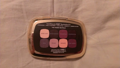
As with the other READY 8.0 Eyeshadow Palette I've tried (The September Issue, reviewed here), the palette itself is held in a highly reflective, metallic plastic case that is basically mirrored. This one is gold rather than the silver of the previous one. It looks quite nice and luxurious, but it is definitely fingerprint city! The size of the palette is quite small - its almost the size of my hand.
All shades are labeled on the back rather than in the actual palette.
The eight eyeshadows are organized in rows of four, and there is a full sized mirror in the top lid. The mirror has some suspension to it so it doesn't just flop down, which is useful if you're on the go and need to use the mirror in this to do your makeup - you won't need to prop it up against something.
From left to right, the top row shades are -
Boss Lady - a pale vanilla, very similar to my skintone, with very fine microglitter. The microglitter makes it a little to apparent as a brow highlight, but it works great as a very soft lid color or built up in the inner corner for some shimmer. I was impressed that there was literally no glittery fallout with this shade!
Moneymaker - a matte khaki gray shade, quite similar to MAC Coquette (maybe a touch darker). Its a really creamy matte and not chalky at all.
Schmooze - a light, taupey bronze shade with a good amount of metallic shimmer, but no glitter. This one is super reflective and buttery.
Boardroom - an espresso matte. Slightly chalky, but not so much that I can't work with it. It has a slight warm, reddish quality without being too warm.
From left to right the bottom row shades are -
Exec - a gunmetal gray with very subtle purple tones and the same kind of fine microglitter that Boss Lady had; and the lack of fallout. This one is also super soft and almost has a subdued metallic quality to it.
Payday - a pale, gray taupe shade with a matte finish. Incredible pigmentation and blendability. Its like butter. LOVE. (And, you know, its taupe, so...)
Magnate - a champagne shade with a golden sheen to it. Great pigmentation and nice metallic quality to it.
Get Ahead - a matte, dark, brownish taupey shade. Same qualities of Payday. Super buttery and blendable and alltogether goodness.
The major thing about this palette was; do I really need another neutral palette? Not really - and this one had an especially similar feel to it as the Urban Decay Naked 2 did, in that it was mostly cool toned. However, the quality of this one across the board made it a must have. My favorite shades are Payday, Exec, Get Ahead and Schmooze, and I only really have mild complaints about Boardroom, which could have been better.
Overall:
Pros -
- 7/8 shades had great pigmentation.
- Cooler toned neutral option
- Glitter shades did not have fallout.
Cons -
- Boardroom was a bit chalky.
The only thing holding this palette back from a 10/10 is the chalkiness of Boardroom, but despite that one shortcoming, Power Neutrals is a pretty darn great palette.
9.5/10


No comments:
Post a Comment